Way Cooler: PCA and Visualization - Linear Algebra in the Oracle Database 2
This post shows how to implement Principal Components Analysis (PCA) with the UTL_NLA package. It covers some of the uses of PCA for data reduction and visualization with a series of examples. It also provides details on how to build attribute maps and chromaticity diagrams, two powerful visualization techniques.
This is the second post in a series on how to do Linear Algebra in the Oracle Database using the UTL_NLA package. The first illustrated how to solve a system of linear equations. As promised in part 1, I am posting the code for a couple of procedures for reading and writing data from tables to arrays and vice-versa. Links to the data and code used in the examples are at the end of the post.
Principal Components Analysis
In data sets with many attributes groups of attributes often move together. This is usually due to the fact that more than one attribute may be measuring the same underlying force controlling the behavior of the system. In most systems there are only a few such driving forces. In these cases, it should be possible to eliminate the redundant information by creating a new set of attributes that extract the essential characteristics of the system. In effect we would like to replace a group of attributes with a single new one. PCA is a method that does exactly this. It creates a new set of attributes, the principal components, where each one of them is a linear combination of the original attributes. It is basically a special transformation of the data. It transforms numerical data to a new coordinate system where there is no redundant information recorded in the attributes.
 Figure 1: A two-dimensional data distribution.
- The data dispersion for X1 and X2 is about the same
- The distribution of the data falls along a diagonal pattern
What PCA does is to compute a new set of axes that can describe the data more efficiently. The idea is to rotate the axes so that the new axes (also called the principal components, i.e., PCs for short) are such that the variance of the data on each axis goes down from axis to axis. The first new axis is called the first principal component (PC1) and it is in the direction of the greatest variance in the data. Each new axis is constructed orthogonal to the previous ones and along the direction with the largest remaining variance. As a result the axes are labeled in order of decreasing variance. That is, if we label PC1 the axis for the first principal component then the variance for PC1 is larger than that for PC2 and so on.
 Figure 2: PC1 and PC2 axes and their ranges.
 Figure 3: Coordinates for a point on the original axes and on the PC axes.
The following are the steps commonly taken when working with PCA:
- Center and/or scale the data. If an attribute spans different orders of magnitudes then first LOG transform the attribute
- Compute PCs
- Look at the variance explained (inspection of the Scree plot)
- Select the number of PCs to keep
Implementing PCA with UTL_NLA
The PCA functionality is implemented in the package DMT_PROJECTION by the following procedures and functions (see code at the end of the post):
- pca
- pca_eval
- mk_xfm_query
- mk_attr_map
- mk_pca_query
The pca_eval procedure estimates the ideal number of PCs to keep (see discussion in Example 3 below). It also computes the information for a Scree plot and a Log-Likelihood plot. The latter is used to estimate the number of PCs based on the method described in [ZHU06].
The function mk_xfm_query generates a query string that transforms a source data set to make it more suitable to PCA. It supports three approaches: Centralize only (subtract the mean), scale only (divide by the standard deviation), and z-score (centralize and scale). The scripts for the examples below show how this function is used.
The mk_attr_map procedure creates 2D attribute maps for a set of attributes. The names of the columns with the two coordinates for the map are provided in the argument list. The result table contains the attribute maps for all the attributes listed in the argument list. The first coordinate labels the rows and the second coordinate labels the columns of this table. Example 2 showcases the use of this procedure for data visualization.
The function mk_pca_query generates a query string that can be used to compute the PC representation of data in a table, view, or query. To use this query it is only necessary to append a table name or subquery to the end of the returned string. This procedure is used by the pca wrapper procedure.
Example 1: Planets - Visualizing Major Features of the Data
The data for this example come from François Labelle's website on dimensionality reduction. The data contain the distance of each planet to the Sun, the planet's equatorial diameter, and the planet's density. The goal in this example is to find interesting features in the data set by visualizing it in 2D using PCA.
The following script transforms the data and finds the principal components using the pca wrapper procedure (see comments in the DMT_PROJECTION package code for a description of the arguments):
DECLAREBecause the data span a couple orders of magnitudes I applied the LOG transformation before centering the data using the mk_xfm_query function.
v_source long;
v_score_query long;
v_npc NUMBER;
BEGIN
v_source :=
'SELECT name, log(10,distance) distance, ' ||
'log(10,diameter) diameter, '||
'log(10,density) density FROM planet';
v_source :=
dmt_projection.mk_xfm_query(v_source,
dmt_matrix.array('NAME'),'C');
-- Compute PCA
dmt_projection.pca(
p_source => v_source,
p_iname => 'NAME',
p_s_tab_name => 'planet_s',
p_v_tab_name => 'planet_v',
p_u_tab_name => 'planet_u',
p_scr_tab_name => 'planet_scr',
p_score_query => v_score_query,
p_num_pc => v_npc
);
END;
/
 Table 1: planet_scr table.
 Figure 4: Scree plot for the planetary data.
Table 1 shows that the first principal component (PC1) alone accounts for about 69% of the explained variance (PCT_VAR column). Adding PC2 brings it up to 98.8% (CUM_PCT_VAR column). As a result we can describe the data quite well by only considering the first two PCs.
 Figure 5: Projection of planet data onto the first two PCs.
The picture reveals some interesting features about the data. Even someone not trained in Astronomy would easily notice that Pluto is quite different from the other planets. This should come as no surprise given the recent debate about Pluto being a planet or not. It is also quite evident that there are two groups of planets. The first group contains smaller dense planets. The second group contains larger less dense planets. The second group is also farther away from the sun than the first group.
Example 2: Countries - Visualizing Attribute Information with Attribute Maps
The previous example highlighted how principal component projections can be used to uncover outliers and groups in data sets. However, it also showed that is not very easy to relate these projections to the original attributes (the red arrows help but can also be confusing). An alternative approach is to create attribute maps in the lower dimensional projection space (2D or 3D). For a given data set, attribute maps can be compared to each other and allow to visually relate the distribution of different attributes. Again it is easier to explain the idea with an example.
The data for this example also come from François Labelle's website on dimensionality reduction. The data contain the population, average income, and area for twenty countries.
 Figure 6: Country data projection onto the first two PCs.
We can construct attribute maps with the following steps:
- Start with the PC1 and PC2 coordinates used to create a map like the one in Figure 5
- Bin (discretize) the PC1 and PC2 values into a small number of buckets.
- Aggregate (e.g., AVG, MAX, MIN, COUNT) the attribute of interest over all combinations of binned PC1 and PC2 values, even those not represented in the data so that we have a full matrix for plotting. The attribute being mapped can be one of those used in the PCA step (population, average income, area) or any other numeric attribute
- Organize the results in a tabular format suitable for plotting using a surface chart: rows index one of the binned PCs and columns the other
Using DMT_PROJECTION.MK_ATTR_MAP procedure I computed attribute maps for Population, Average Income, and Area. Here is the code:
DECLAREThe code has two parts. First it does PCA on the data. Next it creates the maps. The maps are persisted in the COUNTRY_ATTR_MAP table. The bin coordinates for each country are returned in the COUNTRY_BVIEW view. The query used for creating the maps joins the original data with the PCA projections from the country_u table. To create a map for attributes not in the original data we just need to edit this query and replace the original table in the join with the new table containing the data we want to plot.
v_source long;
v_score_query long;
v_npc NUMBER;
BEGIN
v_source :=
'SELECT name, log(10,population) log_pop, ' ||
'log(10,avgincome) log_avgincome, log(10,area) ' ||
'log_area FROM country';
v_source := dmt_projection.mk_xfm_query(v_source,
dmt_matrix.array('NAME'),'Z');
-- Compute PCA
dmt_projection.PCA(
p_source => v_source,
p_iname => 'NAME',
p_s_tab_name => 'country_s',
p_v_tab_name => 'country_v',
p_u_tab_name => 'country_u',
p_scr_tab_name => 'country_scr',
p_score_query => v_score_query,
p_num_pc => v_npc
);
DBMS_OUTPUT.PUT_LINE('Example 2 - NumPC= ' || v_npc);
-- Define query to create maps
v_source := 'SELECT a.name, log(10,population) population, '||
'log(10,avgincome) avgincome, '||
'log(10,area) area, '||
'b.pc1, b.pc2 ' ||
'FROM country a, country_u b ' ||
'WHERE a.name=b.name';
-- Create maps
dmt_projection.mk_attr_map(
p_source => v_source,
p_nbins => 4,
p_iname => 'NAME',
p_coord => dmt_matrix.array('PC2','PC1'),
p_attr => dmt_matrix.array('POPULATION',
'AVGINCOME','AREA'),
p_op => 'AVG',
p_bin_tab => 'COUNTRY_BTAB',
p_bin_view => 'COUNTRY_BVIEW',
p_res_tab => 'COUNTRY_ATTR_MAP');
END;
/
For this example I set the number of bins to 4 because the data set is small. The more rows in the data the more bins we can have. This usually creates smoother maps. The procedure supports either equi-width or quantile binning. If we use quantile binning the maps display an amplification effect similar to a Self-Organizing Map (SOM). Because we create more bins in areas with higher concentration of cases, the map "zooms in" these areas and spreads clumped regions out. This improves visualization of dense regions at a cost that the map now does not show distances accurately. A map created with quantile binning is not as useful for visual clustering as one created with equi-width binning or using the original PC projections as in Figure 5.
 Figure 7: Population attribute map.
 Figure 8: Average income attribute map.
 Figure 9: Area attribute map.
The maps provide a visual summary of the distribution of each attribute. For example, Figure 7 shows that China and India have very large populations. As we move away from China (the population peak) population drops. Figure 8 shows high average income countries in the middle of the map and cutting across to the upper right corner.
It is also very easy to relate the attribute values in one map to the attribute values in the other maps. For example, the maps show that, in general, countries with larger average income (purple in Figure 8) have smaller population (yellow in Figure 7), the USA being an exception. Also large countries (purple and red in Figure 9) have large populations (purple and red in Figure 6). Australia is the exception in this case.
Those interested in creating plots like Figures 6-8 with Excel's surface chart should take a look at Jon Peltier's excellent tutorial: Surface and Contour Charts in Microsoft Excel. The output produced by DMT_PROJECTION.MK_ATTR_MAP is already in a format that can be used for plotting with Excel or most surface charting tools. In my case I just selected from the table p_res_tab in SQLDeveloper and then pasted the selection directly into Excel.
Example 3: Electric Utilities - Scree Plots and Number of PCs
An important question in PCA is how many PCs to retain. If we project a data set with PCA for visualization we would like to know that the few PCs we are visualizing accounts for a significant share of the variation in the data. Also for compression applications we would like to select the minimum number of PCs that achieve good compression. Again this will become clearer with an example.
The data set for this example can be found in [JOH02] and Richard Johnson's web site (here). The data set gives corporate data on 22 US public utilities. There are eight measurements on each utility as follows:
- X1: Fixed-charge covering ratio (income/debt)
- X2: Rate of return on capital
- X3: Cost per KW capacity in place
- X4: Annual Load Factor
- X5: Peak KWH demand growth from 1974 to 1975
- X6: Sales (KWH use per year)
- X7: Percent Nuclear
- X8: Total fuel costs (cents per KWH)
- Cluster similar utility firms
- Build detailed cost models for just a "typical" firm in each cluster
- Adjust the results from these models to estimate results for all the utility firms
DECLARENext we need to determine if a small number of PCs (2 or 3) captures enough of the characteristics of the data that we can feel confident that our visual approach has merit. There are many heuristics that can be used to estimate the number of PCs to keep (see [ZHU06] for a review). A common approach is to find a cut-off point (a PC number) in the Scree plot where the change from PC to PC in the plot levels off. That is, the mountain ends and the debris start. Until not long ago, there were no principled low computational cost approaches to select the cut-off point on the Scree plot. A recent paper by Zhu and Ghodsi [ZHU06] changed that. The paper introduces the profile log-likelihood, a metric that can be used to estimate the number of PCs to keep. Basically one should keep all the PCs up to and including the one for which the Profile Log-Likelihood plot peaks.
v_source long;
v_score_query long;
v_npc NUMBER;
BEGIN
v_source :=
'SELECT name, x1, x2, x3, x4, x5, x6, x7, x8 FROM utility';
v_source := dmt_projection.mk_xfm_query(v_source,
dmt_matrix.array('NAME'),
'Z');
-- Compute PCA
dmt_projection.pca(
p_source => v_source,
p_iname => 'NAME',
p_s_tab_name => 'utility_s',
p_v_tab_name => 'utility_v',
p_u_tab_name => 'utility_u',
p_scr_tab_name => 'utility_scr',
p_score_query => v_score_query,
p_num_pc => v_npc
);
DBMS_OUTPUT.PUT_LINE('Example 3 - NumPC= ' || v_npc);
END;
/
The pca wrapper procedure implements the approach described in [ZHU06]. The estimated number of PCs is returned in the p_num_pc argument. The procedure also returns the information required to create a Scree plot and the Profile Log-Likelihood plot in the table specified by the p_scr_tab_name argument.
 Figure 10: Scree plot for electric utility data.
 Figure 11: Log-likelihood profile plot for electric utility data.
 Figure 12: Electric utility data projection onto PC1 and PC2 axes.
What happens if we add the information from PC3? Do we still have the same partitions? Can it help to further separate the yellow group?
 Figure 13: Electric utility data projection onto PC1 and PC3 axes.
Most of the structures uncovered in Figure 12 are also present in Figure 13. The Blue and Red groups are preserved. San Diego (Green group) is still very different from the rest. One of the Black subgroups (Consolid, NewEngla, Hawaiian) was also kept intact. However, the other Black subgroup was merged with the Yellow group. We can also see that adding PC3 helped split the Yellow group into two subgroups. The partition of the Yellow utility firms takes place along a line that connects PC3 with the opposite side of the triangle.
Recapping, the task was to identify groups of similar utility firms. Using PCA we were able to visually identify 6 groups (Figure 13) with ease. Trying to uncover patterns by inspecting the original data directly would have been nearly impossible. The alternative would have been to use a clustering algorithm. The latter is a more sophisticated analysis requiring greater analytical skills from the user.
In a follow-up post I will show how to implement data interpolation using cubic splines. The implementation does not use the procedures in UTL_NLA, only the array types. However it is another application of Linear Algebra and it can be code against the UTL_NLA procedures.
Technical Note 1: The Math
Given the original data matrix X, PCA finds a rotation matrix P such that the new data Y=XP have a diagonal covariance matrix. The P matrix contains the coefficients used to create the linear combination of the original attributes that make up the new ones. Furthermore, P is a matrix with the eigenvectors of the covariance matrix of X in each column and ordered by descending eigenvalue size. We can achieve compression by truncating P. That is, we remove the columns of P that have the smallest eigenvalues. As a result Y is not only a rotated version of X but it is also smaller.
Let X be an m by n matrix where the mean of each column is zero. The covariance matrix of X is given by the n by n matrix C=X'X. The Singular Value Decomposition (SVD) of X is
The matrix U is m by n and has orthogonal columns, that is, U'U = I, where I is an n by n identity matrix. The matrix S is an n by n diagonal matrix. The matrix V is an n by n matrix with orthogonal columns, that is, V'V = I. Using this decomposition we can rewrite C as
From this expression we see that V is a matrix of eigenvectors of C and S2 is the matrix of eigenvalues of C, the column of both matrices are also ordered by decreasing size of the associated eigenvalue. For example, let Vi be the ith column of V then
where Si2 is the ith element of the diagonal of S2. It is also the eigenvalue associated with Vi.
Setting P=V also solves the PCA problem, that is, V is a rotation matrix with all the desired properties. To illustrate the point further, given the covariance of Y as
If we replace P with V we make Y'Y a diagonal matrix:
So V is a rotation matrix that turns the covariance matrix of Y into a diagonal matrix.
The scores Y on the new coordinate system can also be obtained from the results of SVD. Y can be computed by multiplying each column of U by the respective diagonal element of S as follows
This is what is done in the step that scales U in the pca core procedure (see Technical Note 2 below).
Technical Note 2: The Magic in the Box - Inside the Core and the Wrapper PCA Procedures
The actual code for computing PCA (the core PCA procedure) is very small. This procedure is a good example of how the UTL_NLA package allows implementing complex calculations with a few lines of code. The code is as follows:
PROCEDURE pca ( p_a IN OUT NOCOPY UTL_NLA_ARRAY_DBL,The above code uses Singular Value Decomposition (SVD) for computing PCA. It has three parts. First it does SVD calling a single UTL_NLA procedure (UTL_NLA.LAPACK_GESVD). Then it scales the U matrix to obtain the projections. Finally it scales and squares the S matrix to get the variances.
p_m IN PLS_INTEGER,
p_n IN PLS_INTEGER,
p_pack IN VARCHAR2 DEFAULT 'R',
p_s IN OUT NOCOPY UTL_NLA_ARRAY_DBL,
p_u IN OUT NOCOPY UTL_NLA_ARRAY_DBL,
p_vt IN OUT NOCOPY UTL_NLA_ARRAY_DBL,
p_jobu IN BOOLEAN DEFAULT true
)
AS
v_indx PLS_INTEGER;
v_alpha NUMBER;
v_info PLS_INTEGER;
v_dim PLS_INTEGER := p_n;
v_ldvt PLS_INTEGER := p_n;
v_jobu VARCHAR2(1) := 'N';
BEGIN
IF p_jobu THEN
v_jobu := 'S';
END IF;
-- Get the correct dimensions to use
IF (p_m <= p_n) THEN
v_dim := p_m - 1;
v_ldvt := p_m;
END IF;
-- Compute SVD of matrix A: A = U * S * Vt
UTL_NLA.LAPACK_GESVD(jobu => v_jobu,
jobvt => 'S',
m => p_m,
n => p_n,
a => p_a,
lda => p_n,
s => p_s,
u => p_u,
ldu => v_dim,
vt => p_vt,
ldvt => v_ldvt,
info => v_info,
pack => p_pack);
-- Scale U to obtain projections
IF p_jobu THEN
v_indx := 0;
FOR i IN 1..p_m LOOP
FOR j IN 1..v_dim LOOP
v_indx := v_indx + 1;
p_u(v_indx) := p_u(v_indx) * p_s(j);
END LOOP;
END LOOP;
END IF;
-- Scale and square S
v_alpha := 1 / SQRT(p_m - 1);
FOR i IN 1..v_dim LOOP
p_s(i) := v_alpha * p_s(i);
p_s(i) := p_s(i) * p_s(i);
END LOOP;
END pca;
The pca wrapper procedure is a good example of how easy it is to write powerful code using the UTL_NLA package and the read and write procedures in DMT_MATRIX (see technical note 3 below). The full pca wrapper procedure is listed below:
PROCEDURE pca ( p_source IN VARCHAR2,The procedure has the following main steps:
p_iname IN VARCHAR2 DEFAULT NULL,
p_s_tab_name IN VARCHAR2,
p_v_tab_name IN VARCHAR2,
p_u_tab_name IN VARCHAR2,
p_scr_tab_name IN VARCHAR2,
p_score_query OUT NOCOPY VARCHAR2,
p_num_pc OUT NOCOPY PLS_INTEGER
)
AS
v_query LONG;
v_m PLS_INTEGER;
v_n PLS_INTEGER;
v_dim PLS_INTEGER;
v_a UTL_NLA_ARRAY_dbl := utl_nla_array_dbl();
v_s UTL_NLA_ARRAY_dbl := utl_nla_array_dbl();
v_u UTL_NLA_ARRAY_DBL := utl_nla_array_dbl();
v_vt UTL_NLA_ARRAY_DBL := utl_nla_array_dbl();
v_sc UTL_NLA_ARRAY_DBL := utl_nla_array_dbl();
v_col_names dmt_matrix.array;
v_row_ids dmt_matrix.array;
BEGIN
-- Read table into array
dmt_matrix.table2array(
p_source => p_source,
p_a => v_a,
p_m => v_m,
p_n => v_n,
p_col_names => v_col_names,
p_row_ids => v_row_ids,
p_iname => p_iname,
p_force => true);
-- Compute PCA. It only returns information for
-- PCs with non-zero eigenvalues
pca (p_a => v_a,
p_m => v_m,
p_n => v_n,
p_pack => 'R',
p_s => v_s,
p_u => v_u,
p_vt => v_vt,
p_jobu => false);
-- Get the correct number of components returned.
-- This is the min(v_n, v_m-1)
IF (v_m <= v_n) THEN
v_dim := v_m - 1;
ELSE
v_dim := v_n;
END IF;
-- Make scoring query
p_score_query := mk_pca_query(v_col_names, p_iname, v_dim, v_vt);
-- Estimate number of PCs and scree plot information
pca_eval(v_s, v_sc, p_num_pc, v_dim);
-- Persist eigenvalues
-- Number of cols is v_dim
dmt_matrix.array2table(
p_a => v_s,
p_m => 1,
p_n => v_dim,
p_tab_name => p_s_tab_name,
p_col_pfx => 'PC',
p_iname => NULL);
-- Persist PCs (V) (using pack = C transposes the matrix
-- as it was originally R packed)
-- Number of cols in V is v_dim
dmt_matrix.array2table(
p_a => v_vt,
p_m => v_n,
p_n => v_dim,
p_tab_name => p_v_tab_name,
p_col_pfx => 'PC',
p_iname => 'ATTRIBUTE',
p_row_ids => v_col_names,
p_pack => 'C');
-- Persist scores
-- Number of cols in U is v_dim
-- Using the scoring query so that we project all the data
IF p_u_tab_name IS NOT NULL THEN
v_query := 'CREATE TABLE ' || p_u_tab_name ||
' AS ' || p_score_query || '( ' ||
p_source ||')';
EXECUTE IMMEDIATE v_query;
END IF;
-- Persist scree and log-likelihood plot information
dmt_matrix.array2table(
p_a => v_sc,
p_m => v_dim,
p_n => 4,
p_iname => NULL,
p_col_names => array('ID','PCT_VAR','CUM_PCT_VAR',
'LOG_LIKELIHOOD'),
p_tab_name => p_scr_tab_name);
END pca;
- Read the data from a table into an array
- Perform PCA on the array
- Generate the scoring query
- Estimate the number of PCs and compute the scree and log-likelihood plots
- Persist the PCA results (eigenvalues, PCs, scores, and scree and log-likelihood plot information)
Technical Note 3: Read and Write Procedures
DMT_MATRIX package contains the following procedures for reading and writing data from tables to arrays and vice-versa:
- table2array - Reads data from a table and stores them in a matrix represented by an array of type UTL_NLA_ARRAY_DBL.
- table2array2 - Reads data from three columns in a table (or source) and stores them in a matrix represented by an array of type UTL_NLA_ARRAY_DBL. The first column contains, the row index, the second column the column index, and the third the value. The row and column indexes do not have to be numeric. However, there should be only one instance of a given row-column index pair. This procedure is useful for reading data generated by the array2table2 procedure (see below). It is also useful for reading data with more than one thousand attributes or that it is naturally stored in transactional format.
- array2table - Writes data from a matrix into a table. The table's column names and the matrix row IDs are either specified in the argument list or automatically generated.
- array2table2 - Writes data from a matrix into a table with 3 or 4 columns. The first (optional) column contains an ID for the matrix. This allows storing many matrices in a single table. The ID for a matrix should be unique for each matrix stored in a table. The second column contains the row index. The third contains the column index. The fourth contains the values.
Technical Note 4: Chromaticity Diagram
The approach used for Figure 13 is based on chromaticity diagrams used for color spaces. These diagrams enable three-dimensional data to be compressed into a two-dimensional diagram. The caveat is that points in the original three-dimensional space that are scaled versions of each other are mapped to the same point in the two-dimensional diagram. For example the points (0.1, 0.2, 0.2) and (0.2, 0.4, 0.4) are mapped to the same point (0.78, 0.53) in the diagram. These points represent the same overall pattern. The difference between them is a matter of "strength or scale." In the case of colors the difference between the two points is one of luminance. The second point is a brighter version of the first one. In the case of utilities (see Example 3 above), the second utility has the same operational characteristics of the first but it operates at a larger scale.
The graphics in Figure 13 was created using Excel's 2D scatter plot. The data for the graphics was generated as follows:
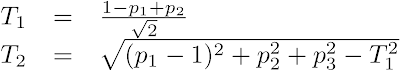
- Normalize each PC projection by subtract it minimum and dividing the result by the difference between its maximum and its minimum. This makes the projected points fall inside a cube with sides of length one.
- Compute the pi projections (i=1, 2, 3) of the points in the cube onto the plane PC1+PC2+PC3 = 1, where (PC1, PC2, PC3) are the normalized PC projections from the previous step:

- Compute the 2D scatter plot coordinates (T1, T2), where T1 and T2 are, respectively, the horizontal and the vertical distances from the triangle's PC1 corner:
The widget below points to the source code for the dmt_projection and dmt_matrix packages as well as scripts for the examples in the post. There are also links to a dump file containing the data for the examples and a script to create a schema and load the data.
References
[JOH02] Johnson, Richard Arnold, and Wichern, Dean W. (2002). Applied Multivariate Statistical Analysis, Prentice Hall, 5th edition.
[ZHU06] Zhu M., and Ghodsi A. (2006), "Automatic dimensionality selection from the scree plot via the use of profile likelihood." Comput Stat Data Anal, 51(2), 918 - 930.
Labels: Linear Algebra, Statistics, UTL_NLA


Hi Marcos,
I want to ask you about the uses of principal components analysis with support vector machine. One of my gleanings, so far, of the mathematics of support vector machine is that the various kernels used in connection with it include among their operations a projection of the dimensional attributes onto a larger number of dimensions. I think you're already knowledgeable of the details, but I'll describe my understanding of what I've read, so you'll be aware of any mistaken assumption from which my thinking may be proceeding. My understanding is that the kernel projection involves, in part, taking the inner product of each pair of attribute vectors. Thus, if I understand, the projection's dimensionality is the square of the attribute vectors' dimensionality, and the addition of one attribute to a model having m attributes results in the addition of (2m + 1) dimensions to the projection. I've been given to understand that this geometric progression makes SVM optimization especially vulnerable to loss of precision as an analyst adds attributes to a model, if he doesn't take care that the marginal "explanatory" value of each attribute is large.
My first question is, do you think I'm right in concluding that SVM can derive an especially large benefit from reduction of dimensionality using PCA? But my second question is, is PCA applicable to cases in which the function from the attributes to the target is thought to be nonlinear?
In the two SVM modeling projects with which I've had my best successes, I've thought nevertheless that I could probably make gains in accuracy, if I could reduce the number of attributes to less than the 50 I presently use, while retaining most of the attributes' total explanatory value. My first thought was that PCA might be a shortcut past the large combinatorial problem that makes it impossible for me to try every subset of the 50 attributes. However, I think the function I'm trying to approximate is nonlinear, and I'm using Oracle's implementation of the Gaussian kernel in my work. (Thanks, Oracle!) So my practical question is: Is my presumed need for the Gaussian kernel a barrier to my preparing the input using PCA, given that each resulting principal component "is a linear combination of the original attributes"? Or is a nonlinear relation of the original attributes to the target preserved by PCA's linear transformation?
By the way, I was glad to receive your follow-up email in our recent exchange. I have a half-written reply that I set aside temporarily when I was struck by ideas for two or three new, candidate ways to improve the training sets for two of my projects.
Thanks for the article on PCA. The technique and the article may be the solution to a longstanding problem.
Doug W.
Posted by Anonymous |
6/17/2007 09:19:00 PM
Anonymous |
6/17/2007 09:19:00 PM
Hi Doug:
Here is a very overdue answer to some good questions.
Before discussing PCA I would like to clarify a couple of points about SVM. The projections created by SVM are related to the number of rows in the data. SVM, internally, may use as many new "attributes" as the number of rows in the data. In this way, adding a new column does not add more projections. It just make the computation of the projections a bit more costly. As a side effect, SVM scales well with the number of attributes but not with the number of rows. Also, because of its regularization features, SVM does well even when the number of attributes is significantly larger than the number of rows. That is the reason SVM is used successfully in bioinformatics and text mining. All that said, it does not mean that irrelevant attributes does not impact the performance of the algorithm. This is probably more of a problem than correlated attributes.
PCA can help extract some of the essential aspects of the predictors and thus reduce the dimensionality of the input space. It will speed up SVM but won't reduce the number of projections available to the algorithm as this number is a function of the number of rows. It may lead to improved performance by removing irrelevant attributes and correlated ones. It is okay to do PCA even if the function you want to fit is nonlinear. PCA is done on the predictors only. It does not include the target. The SVM gaussian can then be used to uncover the nonlinear relationship with the target.
Posted by Marcos |
11/16/2007 08:02:00 AM
Marcos |
11/16/2007 08:02:00 AM
Hello Marcos,
I saw your post about PCA while I was trying to find out something about PCA. What I'm trying to learn is, is there a proper way of scaling the feature vectors before applying PCA. Feature vectors in my feature matrix have great variations in range. For example, range of one feature vector is [-1,1] while some other's range is [-10^10, 10^10]. Subtracting the mean of each vector does not help because this time one of the eigenvalues suppresses the others.
Is it a proper way to first scale data with z=(x-mean)/std_dev then center it?
Thanks in advance.
Eric
Posted by Anonymous |
3/12/2009 12:00:00 PM
Anonymous |
3/12/2009 12:00:00 PM
Eric,
If you Z-score the data (x-mean)/std_dev it should help and the data will be centered.
-Marcos
Posted by Marcos |
4/19/2009 06:05:00 AM
Marcos |
4/19/2009 06:05:00 AM
Great posts. Have you noticed any overhead (say compared with calling LAPACK by other means?) or performance issues other than the restriction on the number of matrix elements?
Posted by Annisa |
11/12/2009 10:18:00 PM
Annisa |
11/12/2009 10:18:00 PM
Hi Annie:
We have measured the performance against LAPACK running in FORTRAN directly and there was some overhead. However, if the data is in the database and you have to move it back and forth, it becomes competitive. Another point to note is that UTL_NLA does not use platform specific versions of the LAPACK and BLAS libraries. So it also loses some performance because of this compared with platform specific implementations of the libraries.
Posted by Marcos |
11/19/2009 07:44:00 AM
Marcos |
11/19/2009 07:44:00 AM